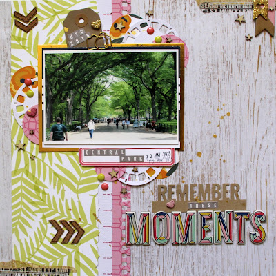
I wasn't given a brief to work from and basically I could do whatever I wanted (within reason), so I choose to do a 12x12 page and an accompanying project life divided page protector.
I decided that I wanted to use some of the many photographs I had from my holiday last year to Central Park, NY.
The paper are from Pebbles Jen Hadfeld - Everyday Collection (here), and embellishments from Crate Paper - Maggie Holmes - Shine Collection.
and a few close up of the 12x12 page.
I also decided to use Becky Higgins Page Protector - Design P, which have 4x4 pockets and randomly added photos of our 'Day in the Park'.
I used a mixture of photo sizes for the inserts, as well as having a few of the pockets with no photos.
I designed and cut this out on my silhouette cameo for each of the delegates. Well I actually designed a 2nd version, as I couldn't decide which one l like best the other said 'A Day at the Park'.
I tried to add some variety to some of the insert, so for this one, I made a pocket for one of the inserts and added a tag, as well as some hand stitching around 2 edges.
This one I just some of the chipboard shapes and stitched around the edges.
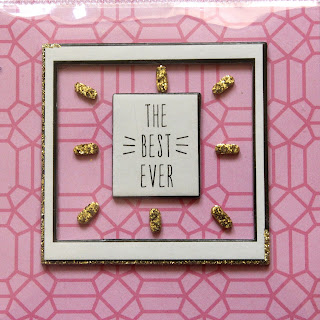
A combination of the chipboard shapes and gold foam stickers.
Then as an added bonus I did the reverse of the page protector.
The class is simple in design, but I do hope that the delegate enjoy putting it all together, and like me get some of the many photographs that we take of one event.
I will be back shortly with some photographs of the weekend and hopefully if I manage to finish any layouts I will upload those as well.
Happy scrapping x


0 comments:
Post a Comment